It’s been over a year since Google launched Android Wear. However, the platform has failed to take off in a big way, currently holding just 11.3 percent of the global smartwatch market, having shipped around 720,000 units in 2014. The original Moto 360 was the clear leader among the various Android Wear models.
Motorola evidently wants to build on the success of the 360 and continues to push the idea of smartwatches with the Moto 360 (2nd Gen), which starts at Rs. 19,999. This new smartwatch is a lot like its predecessor, but has a few key changes that should improve upon the previous model. We find out what the updated version is all about in our review.
 Design and display
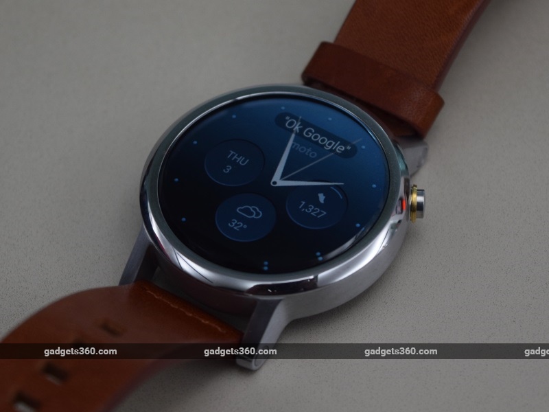
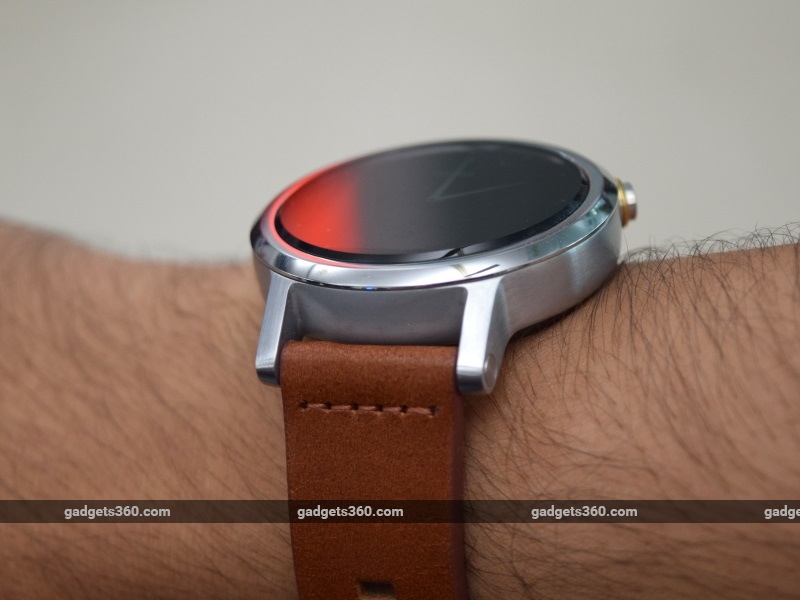
One of the key reasons that the 2014 Moto 360 was more successful than other Android Wear smartwatches was its round shape. This made it far better looking, and more watch-like than its counterparts. Fortunately, the Moto 360 (2nd Gen) remains round, and as a result looks fantastic. At 11.4mm, it’s still fairly thick, but that’s necessary in order to fit in all of the components that make the watch smart.
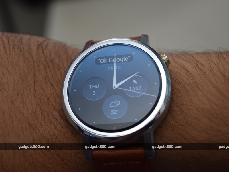
One of the biggest complaints that we had with the design of the old Moto 360 was the black bar on the bottom, commonly referred to as the ‘flat tire’. The bar is still present on the 2nd Gen model, and once again we’re unhappy about the fact that the display isn’t truly round. Motorola’s reasoning for this is that the bar houses the ambient light sensor that enables an auto-brightness mode. Without the bar, the watch would be thicker, but this seems like a half-baked explanation considering that the LG Watch Urbane is slimmer despite having a perfectly round screen. The bar doesn’t really get in the way and we got used to it soon enough, but it’s a bit of a disappointment that Motorola didn’t rectify this with the Moto 360 (2nd Gen).
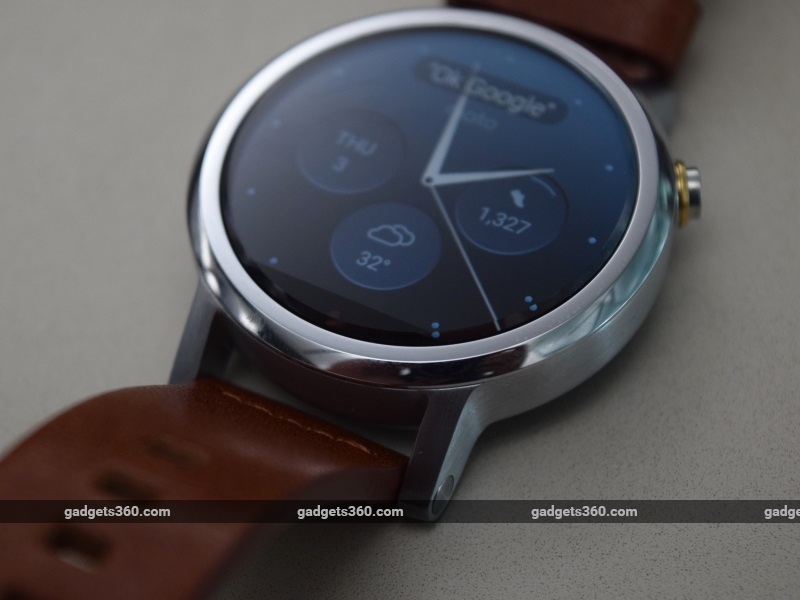 The new Moto 360 (2nd Gen) features a 1.37-inch IPS LCD display, with a 263ppi density. There’s a larger variant with a 1.56-inch display, which means the ppi count drops to 233. The screen is extremely sharp and easily legible even under harsh sunlight. Touch responsiveness is excellent as well, and the watch usually accurately senses the wrist-flick gesture that is meant to turn the screen on. The ambient light sensor adjusts brightness to ideal levels, but this can be switched off if you choose.
The biggest difference between the previous generation model and the current one is the fact that the new Moto 360 is available in five different variants. Four of these are aimed at men, while one is for women. For Rs. 19,999, you can buy the 42mm silver variant with a brown leather strap, the 42mm black variant with a black leather strap or the 42mm gold women’s variant with a blush leather strap. Rs. 22,999 will buy you the 42mm silver variant with a metal strap, while Rs. 23,999 will get you the 46mm black variant with a metal strap. Our review sample was the 42mm silver variant. The button is moved slightly higher up the edge, rather than in a central position.
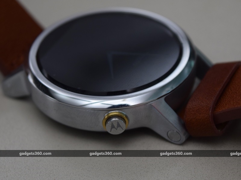 The only differentiating factor of the women’s variant is the fact that the lugs are closer to each other, and the strap is narrower as a result. This is a marked change from the 2014 model, which didn’t have lugs at all. You can now easily replace the stock strap if you choose to, and any standard 16mm (for the women’s variant), 20mm (for the 42mm variant) or 22mm (for the 46mm variant) bands can be used instead. The leather strap on our review unit was comfortable and attractive.
The watch is IP67 water resistant, but the leather strap meant that we had to be careful around water. We’d recommend the metal variant, or a third-party rubber strap if you intend to use this watch in environments in which it might be exposed to moisture.
 Specifications and performance
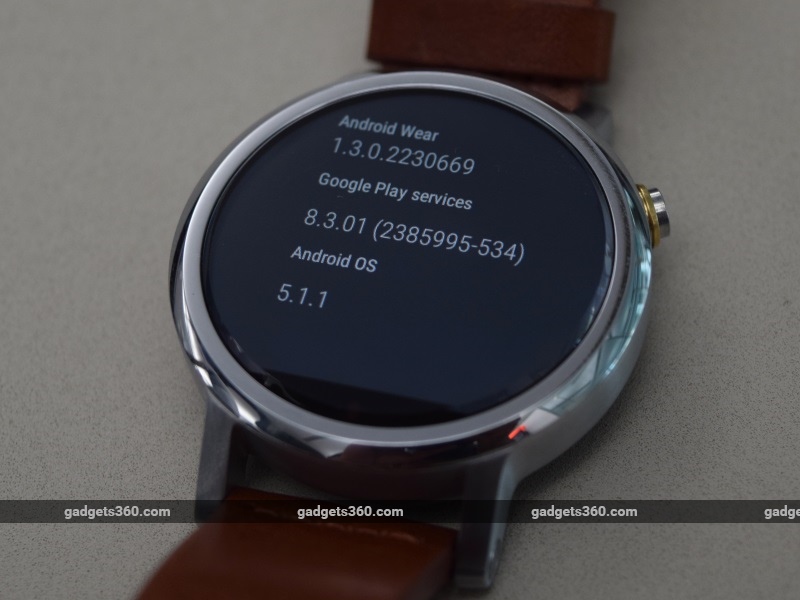
The Motorola Moto 360 (2nd Gen) runs Android Wear 5.1.1 out of the box, which is vastly improved over earlier versions of the operating system. Some key features of the new OS are wrist-flick navigation which lets to move between notifications and cards using flicks of your wrist, retrieving dismissed notifications, a cinema mode that prevents the screen from switching on without deliberate action, and improved information on battery and storage status through the companion app.
The Android Wear app has also been updated, and it’s now possible to control most of your watch’s functions through your phone. Most significantly, it’s now possible to use some Android Wear devices, including this one, with select iOS devices.
On the hardware side, the Moto 360 (2nd Gen) makes one significant and much needed improvement. The SoC has been upgraded to the quad-core 1.2GHz Qualcomm Snapdragon 400 that most other Android Wear devices utilise. The Texas Instruments SoC in the previous generation Moto 360 was at the root of most of its performance issues, and the use of the much more capable Snapdragon 400 makes all the difference.
The 2nd Gen model is a much more capable performer, free of the lag and iffy performance that plagued its predecessor. The Snapdragon 400 was used extensively in budget and mid-range smartphones through 2013, and is more than powerful enough to run Android Wear devices smoothly. The watch also has 512MB of RAM, 4GB of internal storage, Bluetooth 4.0, and Wi-Fi. Android devices need to be running version 4.3 or above to properly use the Moto 360 (2nd Gen).
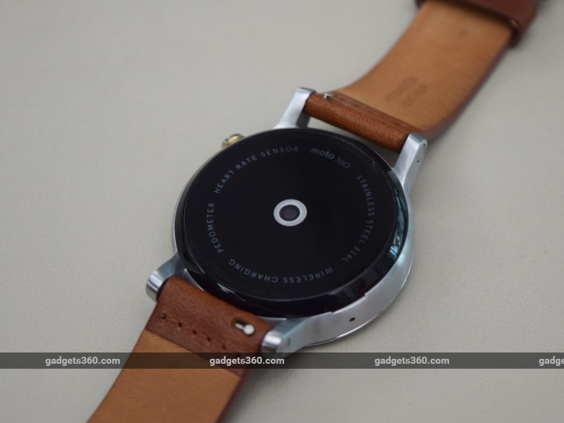
 Although Android Wear is essentially the same operating system no matter what the device, Motorola does manage to add a bit of extra value to the Moto 360 (2nd Gen). This includes a decent selection of watch faces, a custom watch face designer that lets you put a picture of your choice in the background, and the excellent Moto Body app. This maintains a count of steps taken and heart rate, and uses the sensor at the bottom of the device to give you a pulse readout. The readout wasn’t always accurate though, usually overestimating the actual pulse rate.
Like its predecessor, the Moto 360 (2nd Gen) uses inductive charging to power up the device. You simply have to drop the watch onto its charging cradle, and the charger takes over. You can place the watch on the cradle in any orientation. The charger has been vastly improved over the previous generation, and now has a detachable USB cable. Additionally, the main adapter has two USB ports, so you can charge another device at the same time as the watch.
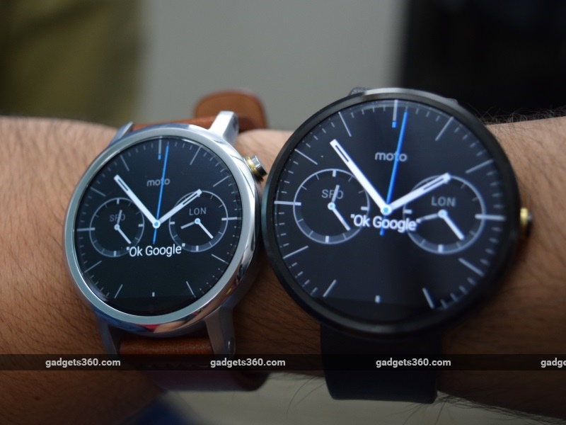 Moto 360 (2nd gen) vs. the original Moto 360 (right)When in charging mode, the watch takes on a specific watch face, which indicates the time and the charge level. You can swipe about to change the colour scheme, but the watch is unusable while charging, except as a bedside clock. Charging is quick, and you can juice up the 300mAh battery from zero to 100 percent in under two hours. The watch lasted a day on a full charge with the ambient display mode switched on, and a little over a day with it off, which is much better than the previous Moto 360 model could do. The 46mm variant has a larger 400mAh battery which should stretch the battery life in both cases.
 Verdict
The original Moto 360 was a success story for the Android Wear platform. Although it looked fantastic, it had some shortcomings and was comprehensively outperformed by other Android Wear devices such as the Sony Smartwatch 3. Motorola has fixed a lot of the problems with its previous device, and has improved just enough to make the Moto 360 (2nd Gen) relevant and worthwhile.
Apart from a huge improvement in performance, the screen is a bit sharper and swapping out watch straps is a lot easier now. There is also the option of a smaller size, which might appeal to some people who prefer smaller watch dials. Unfortunately, the ‘flat tire’ bar has not been eliminated, and battery life, while slightly improved, is still somewhat poor for a smartwatch. Even considering all of that, the Moto 360 (2nd Gen) is the best Android Wear device you can buy right now.
Price (MRP): Rs. 19,999 to Rs. 23,999
Pros
- Improved performance
- Sharp screen
- Good set of watch faces
- Straps can be changed easily
- Moto Body app is excellent
Cons
- Screen isn’t truly round thanks to sensor bar
- A bit expensive
- Poor battery life
Ratings (Out of 5)
- Design: 4.5
- Performance: 4
- Value for money: 3.5
- Overall: 4
Download the Gadgets 360 app for Android and iOS to stay up to date with the latest tech news, product reviews, and exclusive deals on the popular mobiles.
