One surefire way to tempt people to buy your product is to offer it at a low price, and that is exactly what practically every Android phone maker in India has been doing over the past year or two. We’re now seeing smartphones at the Rs. 5,000 mark which we wouldn’t have imagined seeing selling for even twice as much a little while ago.
The lower prices go, the more potential first-time buyers will take a leap. That means there are willing and able customers out there who don’t necessarily fit the mould that manufacturers have been catering to. Sensing an opportunity that foreign companies will take time to capitalise on, Micromaxhas been pushing out low-end phones with specific tweaks that it thinks will cater to newbies – particularly non-urban, non-English-speaking ones who have only ever used voice and maybe SMS services until now.
The new Canvas Spark 3, priced at just Rs. 4,999, could be just the right product for a huge number of buyers who have never before had a viable computing device that they could afford and use. We’re all for digital inclusiveness, so we’re really eager to see whether Micromax has managed to implement these strategies well.
Look and feel
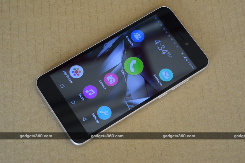
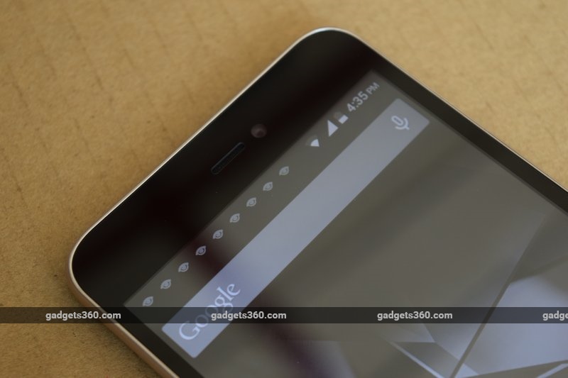
Surprisingly for a Rs. 5,000 phone, the Canvas Spark 3 looks and feels pretty good. It doesn’t seem cheap or poorly fabricated like low-cost devices used to. The front is plain, and only the camera and earpiece tell you which way is up – navigation buttons are on-screen rather than capacitive touch points below the display. There’s very little blank space to the left and right of the screen, making it relatively easy to stretch across it with one thumb.
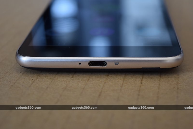
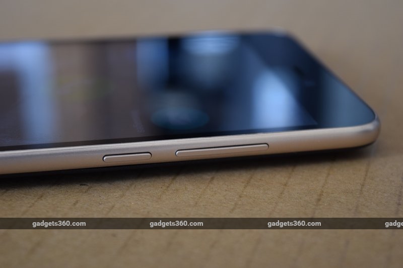 You won’t find this phone too heavy, and its curves makes it pretty comfortable to hold and use. A metallic band runs around the sides. You’ll find the power and volume buttons on the right, the audio socket on top, and the Micro-USB port at the bottom.
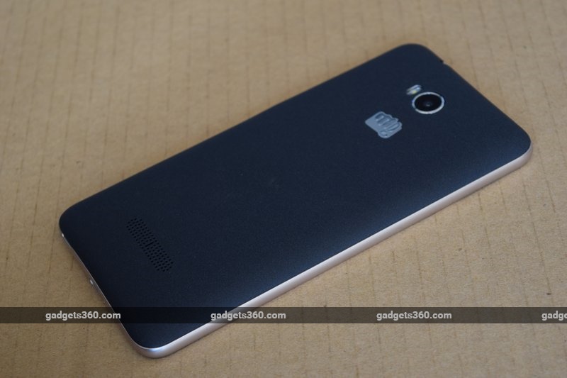
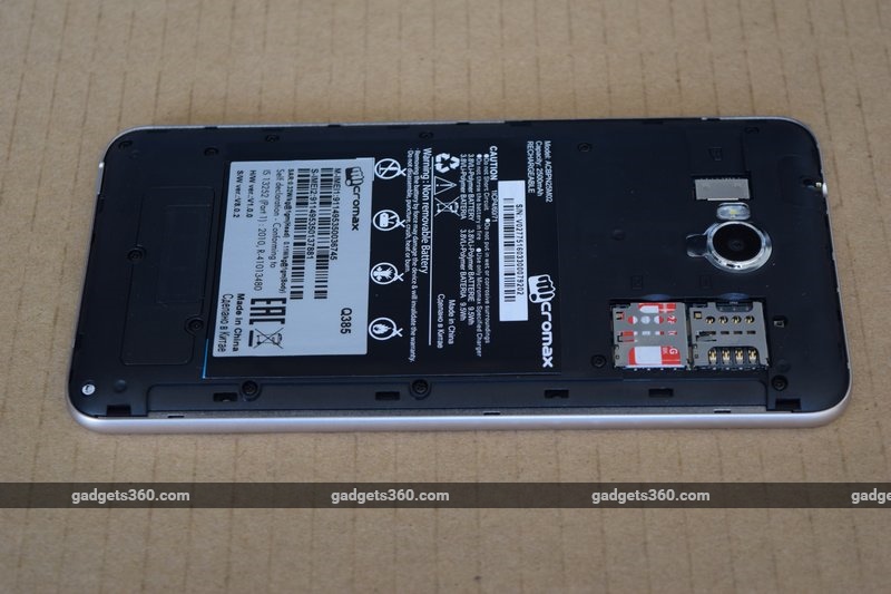
The rear is a removable plastic panel with a matte texture which allows for a decent grip. The camera and flash are up top, with a Micromax logo beneath them. Towards the bottom is a fairly large speaker grille. The two Micro-SIM slots and the microSD slot are beneath the cover, and you’ll have to pop the battery out each time you want to swap a card.
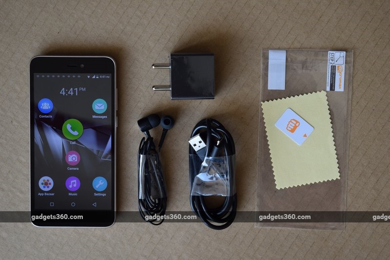
 The Canvas Spark 3 comes with a charger, USB cable, headset, adhesive screen protector, and even a little microfibre cloth to wipe off smudges and fingerprints. That’s a decent package considering the price.
Specifications
The Canvas Spark 3 uses a processor from Spreadtrum, a lesser-known Chinese chip design outfit. The SC7731G is fairly bare-bones, with four ARM Cortex-A7 CPU cores running at 1.3GHz, and a Mali-400MP2 GPU. The phone can handle two Micro-SIMs but there’s no support for 4G, which makes it a bit of an outlier in today’s market.
 There’s 1GB of RAM and 8GB of storage. However, the phone only reports 4.76 GB of usable space, of which quite a bit is already occupied by system files leaving barely anything for users. This is the first phone we’ve reviewed in a really long time that didn’t have enough space for all our benchmarking apps and files. You’ll need a microSD card for sure, and so it’s a further disappointment to see that official support only goes up to 32GB.
The 5.5-inch screen has a resolution of 720×1280, which is one of the few bright spots on the spec sheet. The primary camera has an 8-megapixel sensor and you also get a 5-megapixel front camera. However, video recording only goes up to 720p with the rear camera and 480p with the front one.
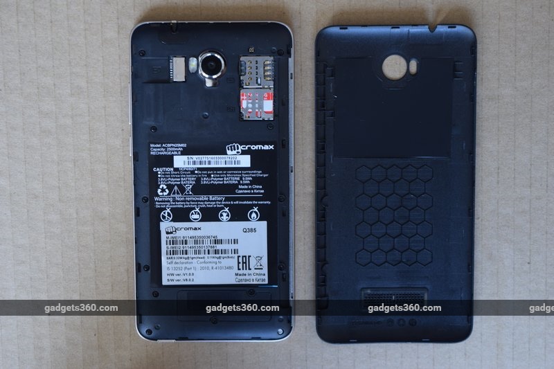 You get Wi-Fi b/g/n and Bluetooth 4.0. The phone appears to lack an ambient light sensor, so brightness always has to be adjusted manually. The removable battery has a rated capacity of 2500mAh.
Software
Micromax’s software choices are a bit confusing – the company seems to be targeting first-time Android users with the highly simplistic multi-language Indus launcher, but then there are some overly complicated apps and a whole bunch of features that would overwhelm any non-tech-savvy user.
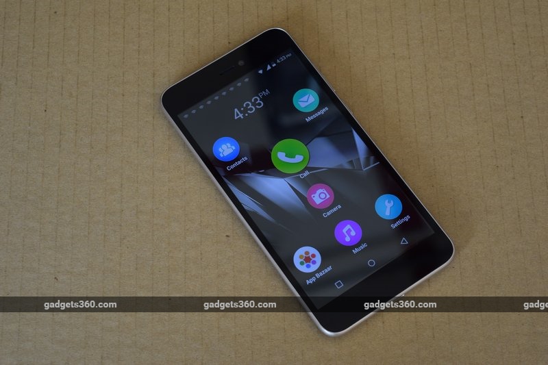 First of all, the phone runs Android 5.1 but when you boot it up, you’ll see the custom Indus home screen with seven giant icons for basic functions. There’s a second home screen to the left, for no apparent reason, and sliding to the right takes you to the equivalent of a separate app drawer with its own pages that you scroll through horizontally. Each time you exit an app, you’re taken back to the leftmost home screen, so you have to swipe multiple times to get back to the page you were on, which is really slow. It’s a confusing navigation scheme, but at least app icons have a place to stay.
Support for home screen widgets seems to have been eliminated altogether. There’s an iOS-style dock with four oversized icons on the app drawer pages, but neither this nor the home screen layout can be customised at all. What’s most disappointing is that they just take you to the standard Android dialler, contacts, camera and messaging apps – the extent of UI simplification is literally only that the icons have been enlarged and pinned in place.
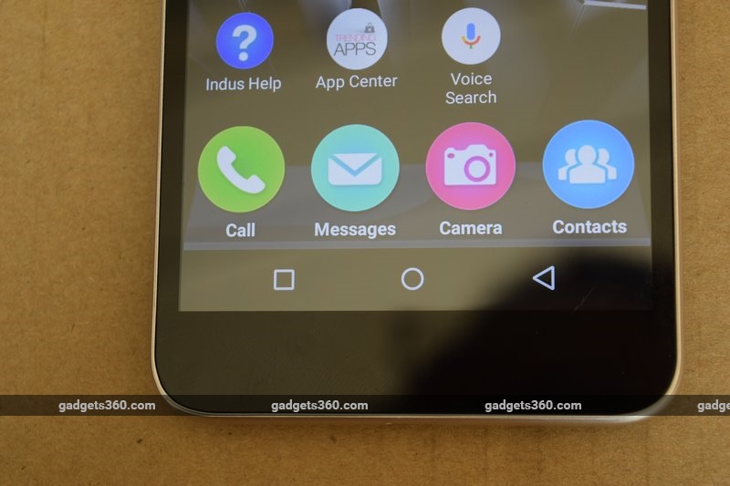 You can easily get to the Indus launcher settings, where you can select languages and tweak other basic settings, but the main Android settings icon has been hidden. You’ll have to pull down the notifications shade, pull down again to show quick shortcuts, and then use the Settings icon there. The Google Settings icon is still shown with the other apps, as if things weren’t confusing enough. Interestingly, there’s also an option in the Indus settings to switch to the stock AOSP launcher, which is a huge relief.
Local-language support is basically implemented the same way as we saw on the Micromax Unite 2(Review | Pictures) almost two years ago, except that the list has been pruned from 21 languages to 10. UI localisation is still spotty, with some labels changing language and others staying in English no matter what. You can select two primary languages and toggle between them quickly. The Indus keyboard is a little crude, but gets its job done.
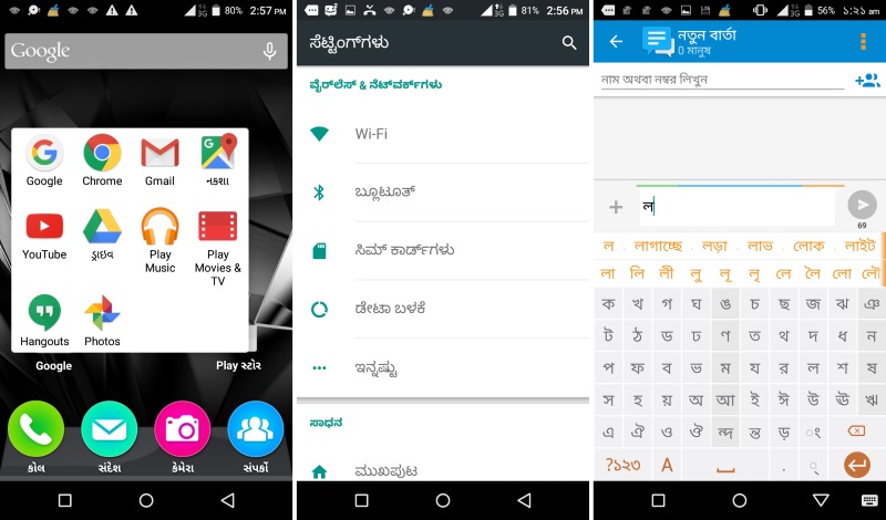 Micromax has preloaded quite a lot of software, some of which is of little use and redundant. There’s the Indus app store, another one called App Center, and Micromax’s own M!Games and M!Live storefronts. There are also a few common apps and games: Amazon Shopping, OLX, Ixigo Cabs, Snapdeal, Hike, Quickr, Scandid, Opera Mini, Gaana, Clean Master, CM Security, CM Locker, and M Travel. Luckily, the third-party ones are all removable to reclaim space.
CM Locker replaces the standard lock screen with a far more complicated, interactive one. You’ll be prompted to give it permissions to handle notifications and other things. You can see detailed weather information if you swipe to the left, and there’s an iOS-lookalike shortcuts panel if you swipe upwards. There are also app shortcuts and little bits of information about charging status. It even has its own settings panel from which you can choose security settings and find themes, though these throw up a message saying they won’t work unless you install CM Launcher, which is bound to confuse users. There are also ads, which seems like a running theme across Micromax’s software selection.
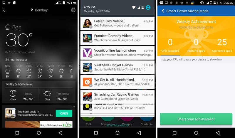 CM Locker displays ads on your lock screen, but what’s worse though is that some of the other preloaded apps constantly spam you with ads in the form of system notifications. We received around 10 such alerts each day, pushing app downloads and offering “services” such as Bollywood gossip and dating tips – all for monthly fees. At one point we were “challenged” to earn prizes by turning on a battery saving mode and then share that “achievement” to social media.
Clean Master and CM Security also send notifications about things like purging apps from RAM, which will unnecessarily worry users. CM Security has some useful features like grabbing photos of people who try to guess your passcode, but is also blatantly misleading in some ways, with a “Wi-Fi Security” module that did nothing but run a speed test (over 3G, no less) and then suggest that we download unrelated apps listed as “recommended features”. Yeesh.
 Performance
First of all, this phone lags a lot. Popping out of an app to the home screen can sometimes take a few seconds. A lot of apps struggle to function even in basic tasks, such as swiping through the photo gallery. This might be partly because of the CM Security app which runs in the background and seems to interact with running processes – we ran the pre-installed Snapdeal app and it threw up a message warning us that it was malicious and “may lead to financial losses and privacy leakage”.
The phone’s display is pretty low-quality. Dark scenes in videos look artificial, and viewing angles are extremely poor. That said, at least the 720×1280 resolution ensures that things aren’t too grainy, and we’re glad to have at least that much on a phone this affordable. The built-in speaker gets surprisingly loud. Sound quality leaves a lot to be desired, but it’s good enough for games and voices in videos, if not music.
 Benchmark tests showed that the Canvas Spark 3’s hardware is just barely able to keep things running. We got 21,603 points in AnTuTu and 5,023 overall in Quadrant. 3DMark Ice Storm Extreme just about managed to run, with a very weak result of 1,768 points, and GFXBench managed only 6fps. 3D gaming is simply out of the question – you really shouldn’t expect to do anything beyond the most basic things with this phone.
Battery life was fairly decent, at 7 hours, 13 minutes in our video loop test. The screen is by far the biggest drain on the battery, and so with regular usage, we found that the phone lasted through a full day with no complaints – not that we did any gaming or anything intense during that time.


 (Tap to see full-sized images)
The phone’s cameras were not quite as bad as we had expected. Focusing takes a while and there is significant shutter lag as well, so forget about spontaneous shots. On the other hand, quality is okay in the daytime. We needed steady hands and relatively even lighting to avoid complicated exposures, but at least colours were okay and there wasn’t too much artificial compression. Low-light capabilities are practically non-existent, and you’ll need direct illumination in order to be able to make anything out. Video was a bit grainy, which was to be expected.
Verdict
We have to keep in mind that a huge proportion of the potential market for the Canvas Spark 3 has not only never used a smartphone before, but might never have used any kind of computer. While it certainly is remarkable that we can now buy a device of this kind for less than Rs. 5,000, the reality is that there’s a lot that this phone cannot do – and we don’t mean just its weak performance.
 The messy software will not help anyone that it is targeted at, namely first-time users and those who aren’t comfortable with English. There’s so much more needed to make this experience than just a couple of fonts and oversized buttons. The Micromax Canvas Spark 3 could have been a much better product if just a little more thought had been put into things like identifying and catering to the needs of its target audience, rather than trying to cram in as much adware as possible.
Those who already have at least a passing familiarity with Android and just want a really low-cost phone will find the Micromax Canvas Spark 3 adequate. It can do the basics, has a serviceable camera, and doesn’t seem like it will fall apart soon after being bought. That said, models priced even at Rs. 7,000-8,000 offer a whole lot more bang for the buck.
Download the Gadgets 360 app for Android and iOS to stay up to date with the latest tech news, product reviews, and exclusive deals on the popular mobiles.
